Generating technical diagrams as SVG
Architecture and process diagrams belong in the repository next to the document that references them. Drawing them by hand in a vector editor puts them outside review, and the moment a service gets renamed the diagram is wrong and nobody notices.
Generating them instead means writing SVG, which turns out to be almost entirely a text problem.
The two properties that cause everything
<text> does not wrap. A label longer than its box runs straight out the side and keeps going. There is no overflow, no clipping by default, no error.
And its width is unknown until something renders it. A generator emitting SVG has no font engine, so it is sizing a box around a string whose width it cannot see.
What silently fails
<foreignObject> embeds XHTML that wraps properly, and it is the first thing everyone reaches for. Rendering a file containing one through librsvg 2.61.4:
$ rsvg-convert -f png -o out.png feat.svg
$ echo $?
0
Exit zero, empty stderr, and the content absent from the output. The librsvg text layout notes list inline-size and shape-inside, the SVG 2 automatic-wrapping properties, as further work rather than implemented, and the working group marked that area at risk. Testing inline-size:150px on a long label confirmed it: the text ran to x=229 instead of wrapping at 150, with nothing reported.
Mermaid’s documentation says the same thing from the other direction. Its htmlLabels option switches between text with tspan elements and an HTML span, and the docs advise against htmlLabels where the rendered diagram is going to be imported into another tool as SVG. The HTML path does not survive leaving the browser.
The portable set is small. <tspan> with explicit x and dy per line works everywhere. textLength with lengthAdjust works. paint-order works, which matters later. Wrapping has to be decided before the file is written, which means measuring the text.
How the established tools solve it
Worth understanding before reinventing it, because the three main approaches are genuinely different and only one of them is available to a script.
Mermaid measures by rendering. It runs in a browser, so it puts the text in the DOM, asks the browser how big it is, and lays out from the answer. That is why mermaid-cli ships Puppeteer and drives headless Chrome to render a diagram: the layout is not computable without a browser, because the measurement is not. That is the right answer when a browser is available, and no answer at all from a build script.
Graphviz sizes the node from the label. Its width and height are minimums, and the node expands to contain its label unless fixedsize=true. Setting fixedsize=true makes width and height final and emits a warning when the label does not fit. Content-driven sizing by default, with an explicit opt-in to fixed geometry that reports when it clips.
dagre reserves space for labels in the layout. Its edge attributes include width and height, both defaulting to 0, plus labelpos (l, c, r, default r) and labeloffset (default 10). Giving an edge label dimensions makes the layout allocate room for it during ranking rather than dropping it on top of the line afterwards. A label is a box with a size, and the layout makes room for it like anything else.
Their spacing defaults are a reasonable starting point for anything hand-rolled. dagre uses nodesep 50, ranksep 50, edgesep 10, marginx and marginy 0. Mermaid’s flowchart config uses nodeSpacing 50, rankSpacing 50, diagramPadding 20, padding 15 and wrappingWidth 200. Graphviz gives clusters a margin of 8 points and nodes a label margin of 0.11 by 0.055 inches.
Measuring text without a font engine
Every rule of thumb here is some multiple of the font size per character, and measuring real metrics shows where those multipliers break.
Measuring Nimbus Sans, which is metric-compatible with Helvetica, gives an average advance of 0.489 em for lowercase, 0.668 em for uppercase, 0.556 em for digits and 0.278 em for a space. A realistic label like Authentication Service Gateway averages 0.470 em per character.
Running thirty real diagram labels through it, the per-character ratio spreads much further than that average suggests:
| Label | Chars | em/char |
|---|---|---|
| Identity Provider | 17 | 0.424 |
| Notification Worker | 19 | 0.441 |
| HTTPS 443 | 9 | 0.576 |
| ETL | 3 | 0.604 |
| DB | 2 | 0.695 |
| WWW | 3 | 0.955 |
The long labels are safe and the short ones are dangerous, which is the opposite of what I expected. A long label contains spaces at 0.278 em and lowercase at 0.489 em, and those pull the average down. A short acronym is all capitals with nothing to dilute them, and WWW is more than double the width per character of Identity Provider.
That makes any flat multiplier unreliable at exactly the labels most likely to appear in an infrastructure diagram. At 0.55 em per character, seven of thirty labels overflow. At 0.60, five still do, and they are ETL, DB, OK, WWW and MMMMMMMM.
Grouping characters into classes and weighting each class does better and still fails. Weighting uppercase at 0.70, lowercase at 0.52, digits at 0.556 and narrow characters at 0.28 under-estimated eleven of thirty-three labels, which means eleven boxes too small for their text.
The approach that works is not estimating at all. Summing the real advance width of each character is exact apart from kerning:
W = {chr(c): font.getlength(chr(c))/1000 for c in range(32, 127)}
def text_width(s, size):
    return sum(W.get(c, 0.6) for c in s) * size
Across the same sample this over-estimates by at most 2.1 percent, because summing advances ignores the kerning pairs that pull glyphs together. Over-estimating is the safe direction: a box two percent too wide looks fine, a box two percent too narrow clips a letter.
The table is 95 entries for printable ASCII and contains only 20 distinct values, since Helvetica assigns the same advance to whole groups of characters. It compresses to almost nothing and it removes the entire problem.
One caveat that applies to any SVG leaving your machine. The metrics are for the font you measured, and a browser opening the file will substitute whatever it has. A Helvetica-compatible stack (Helvetica Neue, Helvetica, Arial, sans-serif) keeps the substitute close, and adding around 12 percent headroom to every measured width covers the rest. The diagrams in this post were generated that way.
Sizing boxes, and one way to undo all of it
With a width function, a box sizes itself from its content. Wrapping is greedy: add words until the next one would exceed the maximum, then break.
def wrap(text, size, maxw):
    words, lines, cur = text.split(), [], ""
    for w in words:
        t = (cur + " " + w).strip()
        if text_width(t, size) <= maxw or not cur:
            cur = t
        else:
            lines.append(cur); cur = w
    if cur: lines.append(cur)
    return lines
Box width is the widest line plus twice the padding, and height is the line count times the line height plus twice the padding.
Snapping those dimensions to a grid keeps a diagram tidy, and this is where I broke my own work. Rounding to the nearest grid step can round down, which produces a box narrower than the text it was measured to fit. The check I wrote to verify the layout caught it immediately:
OK                       box=40x40  textfits=False
Authentication Service   box=160x40 textfits=False
WWW                      box=60x40  textfits=False
All three were clipping, and grid snapping has to ceil rather than round. Switching round() to math.ceil() fixed all three, and the failing cases were again the short all-capital labels, because they had the least slack to give up.
Placing nodes
For architecture and process diagrams the useful structure is layers. Assign every node a column by its depth from the entry point, space nodes down each column, and centre the column vertically. Edges then mostly point the same way, which is the property Sugiyama, Tagawa and Toda were after in 1981.
Both serious implementations follow the same skeleton. dagre takes its structure from Gansner et al., using network simplex for ranking and Brandes and Köpf for coordinate assignment, with long edges broken into unit-length segments by dummy nodes. The Eclipse Layout Kernel runs five phases: cycle breaking, layer assignment, crossing minimisation, node placement and edge routing, with over 140 options and a choice between barycentre and median heuristics for the layer sweep.
Reimplementing all of that is not the goal. For a diagram of a dozen nodes, layer assignment and even spacing get most of the benefit, crossing minimisation can be done by reordering the list by hand, and what transfers is mostly the vocabulary and the spacing defaults.
The invariant worth enforcing in code is that no two boxes overlap:
def overlaps(a, b):
    return not (a.x + a.w <= b.x or b.x + b.w <= a.x
             or a.y + a.h <= b.y or b.y + b.h <= a.y)
Checking every pair is quadratic and irrelevant at this size, and it turns a visual property into a test.
Routing edges so they do not collide
The first version routed every edge orthogonally through the midpoint of the gap between columns. Rendering it showed the flaw: several edges shared the same vertical segment, so three separate connections drew as one line, and one edge ran along the border of a box it was not connected to.
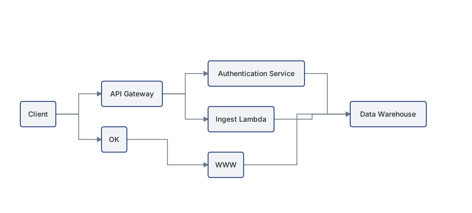
The fix is to treat the gap between two columns as a set of channels and give each edge its own. Order the edges in a gap by the vertical position of their target, then distribute them evenly across the gap width:
step = (gutter_right - gutter_left) / (len(edges_here) + 1)
for i, e in enumerate(sorted(edges_here, key=lambda e: nodes[e.target].y)):
    channel[e] = gutter_left + step * (i + 1)
Sorting by target y is what stops the channels crossing each other. An edge heading to a node near the top gets the leftmost channel, so it turns early and stays out of the way of edges heading further down. dagre’s edgesep of 10 pixels is the equivalent knob.
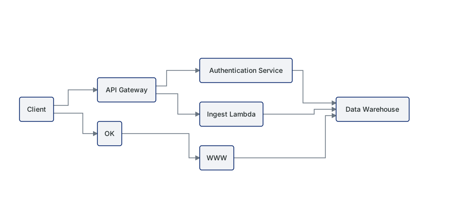
That leaves one artefact. Every edge arriving at a node landed on the same point, the middle of its left border, so three converging edges merged into a single horizontal line before the box. Spreading the arrival points along the border fixes it, which is the port assignment that ELK and Graphviz both expose as a first-class concept:
rel.sort(key=lambda e: nodes[other_end(e)].y)
ports = {e: node.y + node.h * (i + 1) / (len(rel) + 1)
         for i, e in enumerate(rel)}
Sorting the ports by the other end’s vertical position again matters, for the same reason. Without it the edges cross each other in the last few pixels before they arrive.
Edge labels
The mistake is placing a label after the route is decided. Following dagre, a label is a box with a width and a height that occupies space in the layout, and reserving that space during routing is what prevents the collision rather than nudging the label afterwards.
Where a route has to carry a label, widening the channel by the label width and treating the label as an obstacle for other edges costs little and removes the whole class of problem.
For the cases where a label does sit over a line anyway, paint-order gives the text its own knockout in one attribute:
<text paint-order="stroke" stroke="#ffffff" stroke-width="4"
      fill="#202828" font-size="12">retry 3x</text>
The stroke paints first and the fill paints over it, so the line disappears behind the text. Verified through librsvg: the halo interrupts the line underneath exactly as intended.
The label goes on the longest straight segment of the route rather than at the geometric midpoint, because the midpoint of a three-segment orthogonal path often falls on a corner. Offsetting a few pixels perpendicular to the segment reads better than centring on it, which is what dagre’s labeloffset of 10 is doing.
Containers, for infrastructure and network diagrams
Cloud and network diagrams are mostly nesting. A VPC contains subnets, subnets contain instances, availability zones cut across the whole thing, and a security boundary wraps some subset. Graphviz models this with clusters, Mermaid with subgraphs, D2 with containers.
The sizing rule has two constraints and the second one is easy to miss:
w = max(widest_child + 2 * group_pad,
        text_width(group_label, size) + 2 * group_pad)
A container must fit its children, and it must also fit its own label. A subnet holding two small boxes but labelled Private subnet 10.0.2.0/24 is sized by the label, not the contents. CIDR notation makes this common, because the label is frequently longer than anything inside.
The label also needs somewhere to live that is not on top of a child. Reserving a strip at the top of the container and starting the children below it is enough:
GROUP_LABEL_H = 26      # top strip reserved for the container's own label
GROUP_PAD     = 20      # gap between container border and its children
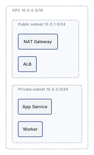
Three conventions make nested containers readable:
Containers get a dashed border and nodes get a solid one, so the eye separates boundary from thing without needing colour. Nesting depth gets a progressively stronger background tint, which is what makes a three-level nest legible at a glance. And the container label sits top-left in a smaller, lighter type than the node labels, because it is a scope marker rather than a component.
For network diagrams specifically, a few things are worth deciding once. Trust boundaries are best drawn as containers rather than as lines between things, because a boundary that is a line has to be traced and a boundary that is a box is read at once. Availability zones cutting across subnets do not nest cleanly, so they usually work better as columns with the subnets repeated, or as an annotation rather than a container. And redundancy is better stated than drawn: a box labelled App Service (x3) beats three boxes, unless the diagram is specifically about the redundancy.
Swimlanes, for process diagrams
Process diagrams have a different constraint. The vertical position of a step carries meaning, because it says who does it, and the horizontal position carries time.
That makes the layout simpler than a general graph. Lanes are fixed-height rows, columns are shared across all lanes so that steps line up in sequence, and a step’s position is fully determined by its lane and its column.
colw = [max(step.w for step in steps_in_column(c)) for c in range(ncols)]
Taking the column width from the widest step in that column across all lanes is what keeps the sequence aligned. Sizing each lane independently would let the same logical step sit at different x positions in different lanes, which destroys the reading.
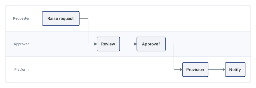
A lane label gutter down the left side, and alternating lane tints, do most of the legibility work. Transitions between lanes use the same orthogonal routing as before.
Shape carries meaning in process diagrams in a way it does not in architecture diagrams, and the flowchart conventions are old and widely understood: a rectangle is a step, a diamond is a decision, a rounded rectangle or stadium is a start or end, a parallelogram is data in or out, a cylinder is storage. BPMN formalises a much larger vocabulary, and most internal process diagrams do not need it. Using the five shapes above consistently gets more value than using thirty inconsistently.
Styling
Colour should encode one thing. Environment, or trust zone, or ownership, or layer. Picking two and encoding both produces a diagram nobody can read. Between five and seven distinct hues is the practical ceiling before the legend becomes the diagram.
It also cannot be the only encoding. Around one in twelve men has some form of colour vision deficiency, diagrams get printed in greyscale, and a projector washes out anything subtle. Every distinction carried by colour needs a second channel behind it, whether that is a border style, a shape, a label or a position.
Line style is the obvious second channel, and the conventions around it are loose but real. Solid reads as synchronous or a direct dependency, dashed as asynchronous or eventual, dotted as optional or inferred. A filled arrowhead suits a call, an open one a data flow, no arrowhead a plain association, and arrowheads at both ends only when the relationship genuinely is bidirectional. Line weight is better kept for emphasis than for meaning, because the difference between 1.5 and 2 pixels does not survive a resize.
Typography wants about three levels and no more: node labels at the base size, container and lane labels one step down in a lighter weight or a muted colour, and edge labels one step below that. Sentence case throughout reads faster than title case and much faster than upper case. A node label running past three or four words is usually a description trying to escape, and belongs in a sublabel or in the prose beside the diagram.
Contrast has a specific threshold. WCAG 1.4.11 requires 3:1 for graphical objects that are needed to understand the image, which explicitly includes the lines and shapes of a diagram. Checking the palette used in this post:
| Pair | Ratio |
|---|---|
Edge line #6A7682 on white |
4.64 |
Node border #002068 on node fill |
13.43 |
Node text #202828 on node fill |
13.54 |
Container border #6A7682 on container fill |
4.40 |
Node fill #F1F3F6 on white |
1.11 |
Lane tint #F7F9FC on white |
1.05 |
The last two look like failures and are not, for a reason worth being precise about. The success criterion applies to objects required to understand the graphic. A node fill tint at 1.11:1 is decorative, because the node boundary is carried by a border at 13.43:1. Remove the border and rely on the tint alone and it becomes a real failure. The rule that follows is simple enough to hold onto: never let a fill tint be the only thing carrying a boundary.
What belongs in the diagram
The C4 model is deliberately notation-independent, which makes its requirements about content rather than appearance, and they transfer to any diagram style.
Every element carries its type, a short description of its responsibility, and for anything deployable, its technology. Every relationship line is unidirectional and labelled, and where it crosses a process boundary the label names the protocol. Every diagram has a title saying what it is and what it covers, and a legend explaining every shape, colour, line style and arrowhead it uses. Acronyms that are not universally understood get expanded.
The legend requirement is the one most often skipped and the one that most often matters, because a diagram outlives the conversation it was drawn in. If the shapes are self-evident the legend costs three lines. If they are not, the legend is the difference between a diagram and a puzzle.
The other rule worth adopting is one diagram, one question. A diagram that answers “what talks to what”, “what runs where” and “what happens when a request arrives” simultaneously answers none of them well. Splitting into three diagrams that each stand alone beats one that needs narration.
Checking a diagram before it ships
The properties worth asserting in code are the ones that are invisible until someone opens the PDF:
- every line of text fits inside its box, using the same width function that sized the box
- every container fits both its children and its own label
- no two node rectangles overlap, and no node overlaps a container it does not belong to
- no edge passes through a node it does not connect
- nothing touches the canvas edge, because the converter clips overflow without reporting it
- every node in the source graph appears in the output
- every element required for comprehension clears 3:1 against what sits behind it
All of these are a few lines each, and they catch the class of error that renders cleanly while being wrong.
Where this leaves me
Two changes carried most of the weight. Measuring the font instead of estimating it, which cost twenty distinct numbers and removed every overflow at once. And sizing containers and channels around labels before placing anything, rather than fitting labels into a layout that was already decided.
What I did not expect was which labels turn out to be dangerous. Every instinct says the long ones. It is the short all-capital ones that break, because they have no lowercase and no spaces to bring the average width down, and WWW costs more than twice as much per character as Identity Provider. An infrastructure diagram is mostly made of the first kind.